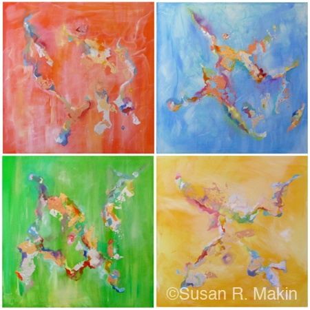
Plane travel is a privilege. Seat belt buckled, I start to relax and enjoy a break from pressures of life on the ground. Spending time in winter-weather Canada, dreams of warmer destinations sustain and sooth. Favorite views are of island formations, miles of beaches, desserts, jungles, lush plains, tropical waters—sun-kissed vistas. My imagination is infinite. It urges to turn up the volume, generate warmth, hope, possibility. This Tropical Topography series as example.
I painted all works in layers and at intervals, choosing a different main color for each separate canvas. All applications of metal leaf were intentional. Every brush stroke counted. Diverse elements came together with a glint of magic. Sun kissed!
Always a colorist, but even more so after a trip to India. Cobalt blue, ruby red, amber yellow, emerald green, all pushed to have place and space, and I let them. Then came gold, silver, and bronze. Each needed to be there, separately and together.
For Topographies 1 and 2, I applied the gold and silver leaf first, then added color bases around them: one color per canvas (red, yellow, blue, green) for each size grouping,. Topographies 3 - 6, phase two of this collection, came in response to the successful completion of phase one, and my evolved. For this, I primed all canvases first, each with a different color base (red, yellow, blue, green). Of prime importance in the beginning here were the colors themselves: being able to see what worked with each.
For every Topography canvas came the build up, layer by layer. Shades, highlights, and contrasts emerged. As specific tones developed or stood out, I went with whatever pushed to appear and gave it room. Forms gradually developed. Then came the challenge: to honor and preserve the message and magic of spontaneous brush strokes Not to overwork was imperative: to set them off to advantage without tainting essence.
Size matters, as does color. With these pieces, I challenge myself and gain insight. I discover what works more easily and what might not work at all. I push, adjust, experiment. “Similar, but different” is a recurring theme: the name of a 2008 Triptych of mine. Different base colors and dimensions influence what works and doesn’t. All canvases experience similar attention to detail, but some appear more appealing than others. Images are set up to fail and/or succeed from the start, even if not realized initially. Interesting to notice which pieces in a particular color and dimension might not work well alone, but have more impact in combination.
